Google News Redesign is Horrible

So, what do you think of the Google News redesign?

You like it???  Tell me where you live so I can come hit you on the head a couple of times with a tack hammer…we’ll see if that jars anything loose.  All kidding aside (no I don’t want to hit anyone on the head with a tack hammer), there is plenty of negative feedback on the redesign.  If you’re not sure what changed, the original Google News Blog announcement is here (with screenshots) and you can also see it on your own computer (for now…they may roll it out to other countries besides the US soon so this may not work perpetually) here is how to check:

  1. Login to your google account.  Go to http://google.com/news
  2. Now visit this link in a new tab:  http://www.google.ca/news

The difference initially looks subtle but once you start scrolling it blares like a fog horn in your head.  I’m not the only one who thinks the redesign sucks.  The original announcement is filled with negative comments about the redesign.  Look on the right hand column of the announcement to see related posts and you’ll quickly see there are plenty of people who despise this ‘improvement’.  Even looking in the google news general forum results in the most popular threads being discussions about how bad the redesign actually is.

People have even begun to label this redesign as the “New Coke” of Google products.  I’m thinking they may be right.  Don’t remember the New Coke snafu?

How Can We Tell Google Their Redesign Sucks?

Most people have been going to the support area for Google news.  In my opinion, this is ABSOLUTELY the wrong area.  Instead, head over to the blog announcement page and you’ll see a link to the Help Center.  Once there, on the top right hand corner of the announcement is a link to comments. As of the writing of this article there were about 15 comments on this change.

It is my theory that Google is only paying attention to this comments section and not to the thousands upon thousands of posts taking place inside their support forums.  Afterall, is complaining that the redesign sucks really a support issue?  Make your voice known by visiting the Help Center and dropping a comment via the comments link there.  Clicking this link opens up a sidewiki comment system.  Make sure you are signed into your google account when leaving a comment.

So what are the problems with Google News?

Tailored News – Google said the new redesign is “tailored to your interests” aka “news for you”.  Here’s the thing…I don’t want news tailored to my interests.  I want unedited and unfiltered news.  The reason I liked Google News in the first place was because I didn’t have paid sponsors results jockying to the front of the page.  I could read liberal and conservative news side by side.  I could get one side of the story and the other side of the story.

Now, I get only the side that interests me.  This doesn’t make for a well informed, rounded individual.  In other words, I want to see EVERYTHING and decide what to read…I don’t want that taken away from me at the beginning.

Scrolling – Congratulations Google!  It now takes me 6 pages of scrolling to see the same amount of news I used to be able to read in 2.  Boy I would have loved to be a fly in the wall on the meeting where the ‘stream’ concept was discussed…a big, monsterous fly so that I could have fly puked right on whoever thought it was a good idea.

Google news is now a facebook stream of news.  I don’t want that.  If I wanted a facebook stream of news, I’d create a facebook account and friend all the news agencies out there and wait for the news to stream to me.

It now takes me three to four times longer to read news than it did in the past.  I’m also getting a poor sample of the news.  I’m missing tons of articles I got in the past and headlines don’t pop like they used to.  It’s also HARDER to read when you’re scrolling 5000 lines of text.  For this reason alone the redesign is 20lbs of crap poured into a 10lb bag.

Local News – Local news went from having its own section to having 3 headlines.  Thanks for reducing my local news Google…I really appreciate that.  Good to know that I don’t need to be reading what’s happening right outside my window.

Fast Flip Reduction – Remember when fast flip was 3-4 wide across the bottom of your google news page?  Now it’s 1 article on the small right hand column.  WORTHLESS.  And of course, there is no way to get rid of it from your google news page.

Spotlight – What the heck is this section for?  What do these articles have in them that allows them to have a spotlight shined on them?  Do publications pay Google to be included in this section?  Why can’t I remove this section if I want to?

Most Popular – These articles are the most popular according to whom?  Am I just supposed to trust Google that they are the most popular ones out there?  Do publications pay Google to be included on this section?  Why can’t I remove it?

A good article that includes many of the reasons I discussed above can be found here.

The Squeekiest Wheel?? Alternatives??

So, if we complain en masse, will Google listen?  Does the squeekiest wheel get the most oil?  I hope so.

Until then, I won’t be using Google News. A suitable and tolerable substitution can be found at Ask.com…for those of you saying “Try Bing!” I did and it sucks.  Ask.com’s News Page is simple and doesn’t require me to scroll 40 times just to read news.  Thanks for keeping it simple Ask!  You’ve got a new supporter!

What do you think of the new google news?  Please let me know with a comment below.  The redesign hasn’t been rolled out in all areas yet so you may not see it in your location…however, be warned that it is probably coming.  Hopefully, Google will realize this move is the New Coke Snafu and backtrack to their original design…not because the features they want to implement suck, but because when implementing them, they made reading the news MUCH harder than it should be.
Hate KDE4? Ignorance Is Probably the Culprit

Let’s bust some myths today because a majority of KDE 4 haters out there have the same reasons for hating it.  I’m pretty sick of seeing posts and news articles about “why I don’t like KDE 4” and then seeing that the real reason the person is upset is because they don’t spend an extra few moments trying to figure things out…aka lazy and ignorant.

KDE 4 was NOT feature complete when it came out in the 4.0 version.  It IS feature complete (in my opinion) with the 4.2 and 4.3 versions.

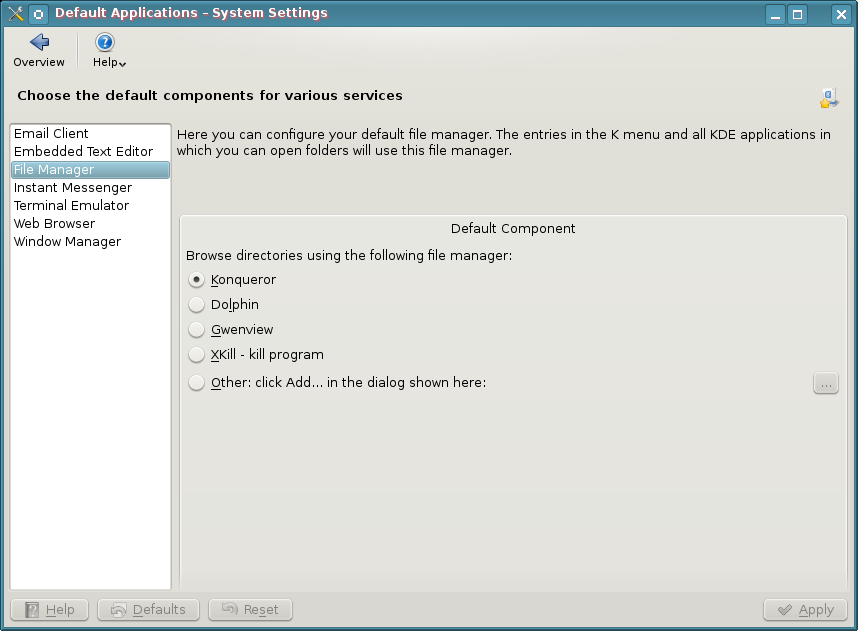
Ignorant Reason #1 – I hate Dolphin and I Can’t Have Konqueror Anymore

filemanagerWrong, you can use Konqueror.  You don’t have to use Dolphin, but you’ll be missing out on a lot of useful stuff.  Tell you what, now that you know that you don’t have to use Dolphin, why not use KDE 4 and give Dolphin a try every so often…you can still use Konqueror in the meantime and now that you know you can, you don’t have to go around trumpeting that you can’t to everyone who will listen and saying what a piece of crap it is.  Forget that you’ll lose nepomuk and the semantic desktop by dismissing dolphin.  Don’t know what that is?  Let me google that for you…

I sure hope this solves many peoples beef with KDE 4 right out of the gate because this is one of the reasons I find all over the web.  I really think the problem is the lethargic attitude that prevails from die hard KDE 3 fans.  Honestly guys, give Dolphin a try…it’s really a pretty decent file manager and is light years ahead of any other DE file manager.

Ignorant Reason #2 – I Can’t Have Folders or Files on the Desktop Anymore

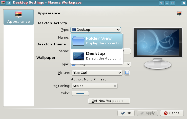
desktopsettingsWrong.  Right click on the desktop and choose “Desktop Settings”.  Select the drop down menu “Type” and select “Folder View”.  Your desktop now has folders, icons, and all other such things that you may want to clutter it with.

If you want to switch back to NOT using the folders and instead use widgets…right click on the desktop and choose “Folder View Settings” >> Select Type >> Desktop.

To top it off, if you select “Folder View”, the folders and icons act exactly like you would expect them to in KDE 3.  Not only can you select to show your desktop folders…but you can even show a folder like /home as your default desktop…show any folder you have access to, it’s up to you.  Yay right?  I give it a golf clap.  Let’s continue thinking out of the box and bust a few more myths.

Ignorant Reason #3 – I Can’t Move My Panel to the Top, Right, or Left.

panelmoveWrong.  Click the settings icon on the right hand side of your panel (it looks like a comma on the far right side of the panel).  The settings area pops open.  On that bar is something called “Screen Edge”.  Now, it seems pretty self explanatory that when you hover over the top of it, it gives you the 4 arrow icon that means you can drag and drop the panel wherever you want to…and being named “screen edge” seems to imply “which screen edge…left, right, bottom, or top…do I want this thing to appear on”.  Then again, I can see how screen edge can confuse people when you open the settings of a panel that resides on the screen edge.  Ok, maybe I can’t.  Well, at least you know you can move your panel around right?  Golf clap again?  Who plays golf anyway?

Ignorant Reason #4 – I Can’t Resize Folders and Files in Dolphin

Wrong again.  Are you sensing a pattern yet?  Open Dolphin, go to the directory where you want to increase the folder size.  Hold the control key down…now roll your mouse wheel and be amazed as the folder size increases.  Invest all your money in Yet Another Linux Blog stock and move to Nicaragua.  Golf clap on your way to expedia.com for purchasing tickets.

Ignorant Reason #5 – I Like to Use My Own Color Schemes…I Can’t Do That in KDE4.

systemsettings
System Settings

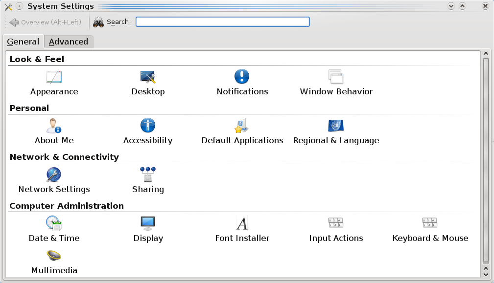
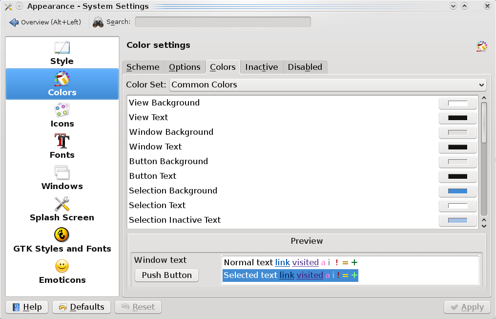
KDE4 absolutely allows you to create your own color schemes.  It really helps to look around inside the system settings tool.  Go to your Kmenu >> System >> System Settings.  Once there, look for Appearance.  You can also use the top search

appearancecolors
Appearance Colors

bar to look for any term…so if you were to type “color” there, you’d see that Appearance & Display are returned.

Click on Appearance and you’re taken into a wonderful world of color and granular control of said color.  Change anything you’d like….go crazy.  I hear pink is the new green…or is it green that was the new pink?  Whatever.  The only limits are your imagination.  For those without imagination.

Ignorant Reason #6 – The Default Menu is Cludgy and Different and I Can’t Find Anything in KDE4

Now there is no right or wrong here…you could be right depending on who you talk to.  However, the nice part about KDE4 is that they include the previous menu for you.  Right click the Kmenu and choose “Switch to Classic Menu Style”.  Now your menu is the exact same as it would be in KDE 3.5.10.  Please remember that answers are out there…you just have to search for them.

Closing the Door on Myths

Hopefully, this closes the door on many misconceptions helps people who are ignorant to the leaps and bounds that KDE4 has made just in the past few months.  I’ve grown very tired of journalists and bloggers taking swipes at KDE4 and spreading misinformation about it.  If you have any questions about how to do something in KDE4, please leave a comment below and let’s work together in finding a solution.

How do YOU Plug Your Blog to Web 2.0?

I’ve been drastically neglecting a few areas of my blog.  The main one is plugging it into social networks.  I’ve been using things like twitter, pownce, and stumbleupon…but I haven’t truly plugged my blog into these services.

Now there are so many…I don’t even know how to plug them all in 🙂

Which services are most important?  Which ones are you, the reader, using?  Thus far, the easiest way I’ve found to manage things is to choose one service like Tumblr or Pownce and aggregate all other services into it.  THEN to use friendfeed.com to envelop them into a stream.

I’m curious as to how others are managing things…I’d like to make Yet Another Linux Blog reach a larger audience and I think that this is a good starting point.  So if you have suggestions, please let me know 🙂

Google Reader, You Suck

UPDATE:  Google Reader has changed their behavior as of late.  This post no longer applies as the behavior I wanted has been integrated.  Thanks for reading Google! 🙂

When I’m not using BlogBridge (that is, when I’m checking my feeds from someone elses computer) I check via Google Reader. It’s been quite nice for me to check out what’s happening in the world of Linux while away from my standard feed reading environment.

Recently though, they have changed the default behavior. Now when I want to mark an entire feed read (feeds with a large number of unread feeds), an annoying confirmation dialog box pops up and I have to confirm that I truly do want to mark all of my feeds as read (in true Microsoftian-esque style mind you).

Whoever enabled this needs to be sentenced to a life of annoying popup dialog boxes. Make their primary desktop be Vista and make them turn on the UAC and make them do their normal job. Sentence them to an entire year of stupid annoying popups. I despise popup dialogs…the demon brain children of the department of redundancy department… (a department google must now have created…and here I thought Microsoft was the only company that had one of these!) more than anything in computing.

Please google reader, take out that stupid dialog! Or at least give us a checkbox option. This type of behavior is frustrating, redundant, and lame.  I cry suckage google reader >:|

Update your RSS Feeds…

I’ve decided to add a feedburner feed. Currently, I don’t even know how many subscribers I have to Yet Another Linux Blog and I’d like to know 🙂 because it’s not a bad service. It’s always interesting to find out if anyone is actually out there reading. So please visit the page in the next few days and if you’d like to use the feedburner feed, please update your feedlist.

Thanks for reading!

Of Vista, Linux, and the User Experience

I was reading this article earlier this week and thought that it was interesting. It announced the Windows Vista release as being delayed. I thought that this was just par for the course and something Microsoft always has done and will always do…delay. However, what does this mean for the Linux desktop? Does it mean anything at all? Probably not on the scale most are hoping.

It’s Opportunity, Albeit, a Small One

Does anyone else here smell that? It’s opportunity. Perhaps an opportunity to push Linux just a little while longer and to develop it into what it needs to be before Microsoft once again proliferates itself onto every PC in America and sets the standard to which all things are compared. I can just see it when Vista finally does release…all of the comparison articles that will sprout across the web between Vista and desktops such as Ubuntu and SuSe 10.X. Linux can gain ground only one way; if it can become about user experience versus user function. If it can do that, I think Linux just might gain some ground. Babysteps…that’s what it is all about.

Microsoft’s OS has always been a rip-off of the work others do. OS/2 did things before Microsoft…Macs did things before Microsoft. They’ve been playing constant catch up since Windows began. If developers and users seize this opportunity in Linux to develop their distros in new ways, it can give Linux a slight foothold onto the desktop. Notice I said slight foothold. That’s because Linux will never storm onto the desktop. It will chip away slowly at the desktop until it gains acceptance. Linux has been granted a small door to the desktop and there is a set criteria for those distros that want to go through it. Will your favorite distro be able to go through the door? Can it provide the user experience needed to win people on the desktop over?

Continue reading “Of Vista, Linux, and the User Experience”

Creative Commons License
Except where otherwise noted, the content on this site is licensed under a Creative Commons Attribution-NonCommercial-ShareAlike 4.0 International License.