2 Amazing Google Reader Replacements You Haven’t Heard Of

It’s that time my friends.  Time for us all to shuffle ourselves off of Google Reader.  I’m very sad because I’ve used it every single day since it was offered to Google users.  It replaced BlogBridge, my favorite RSS client due to its lightweight server side always-available-on-every-platform appeal.  But it’s shutting down within the next few weeks.  These are sad times my friends.

We’ve all seen the discussions on sites like Lifehacker, PCWorld, and TechCrunch all claiming that there are multiple replacements and/or alternatives.  I’ve cycled through the gamut of them and found two relatively unknown gems I’d like to share with you.  I’ve used both of these for a couple of days and I can honestly say…depending on your focus when using a reader, they’re quite nice and can replace Google Reader completely for you…and chances are you haven’t heard of them.

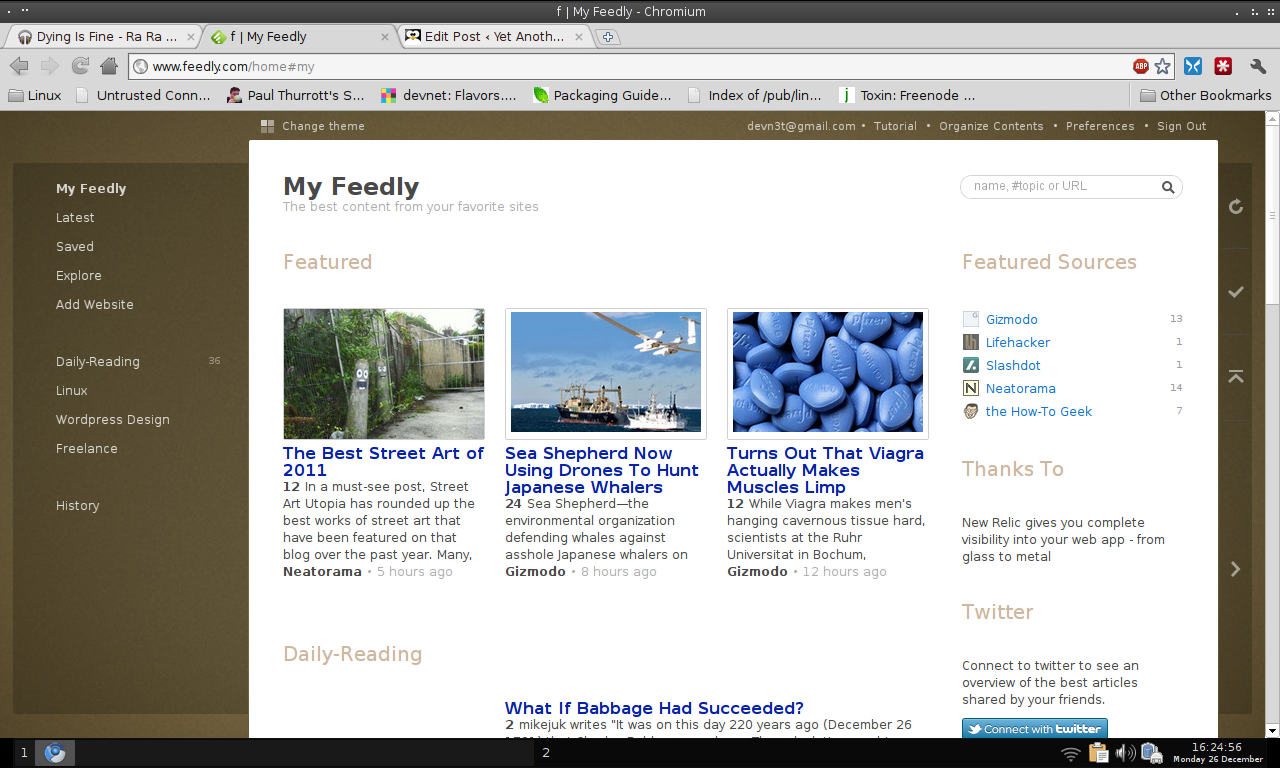
Let me start by saying if you’re a fan of magazine style flipboard readers, nothing beats Feedly.  However, I don’t really think Feedly fits exactly with what Google Reader did.  So while I don’t mind using it for say, things to post on Pinterest…it’s not exactly what I need to get through tons of news quickly.  I find the magazine style pictures distracting when I attempt to make it through hundreds of feeds daily with a focus on news reading.  If you’re not like me, Feedly will work fine for you.  If you are like me, read on and I’ll show you 2 fantastic Reader replacements that you probably haven’t heard of.

InoReader, the Best I’ve Found

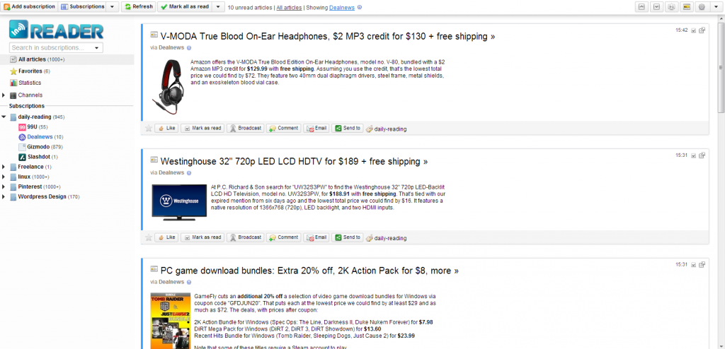
Let’s start with the best reader I’ve found to replace Google Reader…InoReader.  InoReader is a free online reader that allows unlimited feeds with a nice, minimalist UI.

InoReader

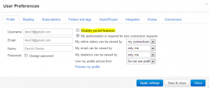
I can’t find anything wrong with the look and feel…it’s very comforting since it is very Google Reader-like.  There are some amazing options available…for instance, if you care little for social networks, you can disable anything social from appearing in your feeds:

DisableSocial

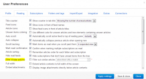
Other options you might be interested in is the ability to eliminate double posts.  This means that if you have a couple of feeds that feature redundant posts, this will eliminate one of them.  Handy if you read tons every single day:

ArticleFilterDouble

I’ve found the speed of displaying feeds to be fantastic…it’s every bit as fast as Google Reader was.  I’ve also found keyboard shortcuts to be functional and fast.  There are 2 feed layouts available and that is full articles (expanded view) and lined articles (list view).  This is perfect for someone with as many feeds as I have.

Do you want statistics?  InoReader has them.  It’s very comparable to Google Readers Trend section.
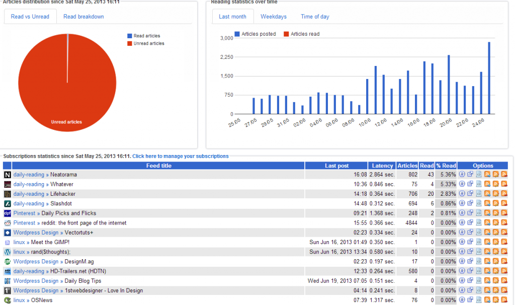
Inoreader StatsAll in all, I’ve found InoReader to be EXACTLY what I need in a Google Reader replacement.  I’m sure some people will find small, niggling things that stick out for them…but for me, it does everything I need it to.  I was able to import my Google Reader subscription file from Google Takeout in a matter of seconds…this in itself is head and shoulders above another reader I tried called “The Old Reader” which took 2 weeks to import my feeds.

InoReader also has a mobile version of its website that autosyncs with my feeds in the browser which is nice when I’m using my tablet or phone.  While there is no Android application as of the writing of this article, the mobile site is quite nice and simple and allows me to do everything I need to do and looks very similar to Google Reader’s mobile site.  There is a Chrome App also available in the Chrome Web Store.  Add things in like ability to search through your feeds, multilanguage support, as well as Pocket and Instapaper integration and you’ll understand why I think that this is the best Google Reader replacement available.

Final Verdict? It’s going to be sticking as my reader for a very long time.

Pros:  Fast, simple, good mobile experience, Android App due for release in July, Standalone login or Google authentication, uses own engine to drive feeds, sound alerts, desktop notifications, ability to change skins/themes.

Cons:  No tags yet (planned for later), Reordering of feeds not yet available (also planned), a few other small things detailed here.

Homepage:  http://inoreader.com

Red Tree Reader – Beauty in Simplicity

Maybe InoReader has too much going on for you.  If that’s the case, you’ll love the minimalist approach of Red Tree Reader.  Please be aware that Red Tree Reader is DEAD simple…as in, there are absolutely NO distractions or features that get in the way of your feeds.  The news is front and center.
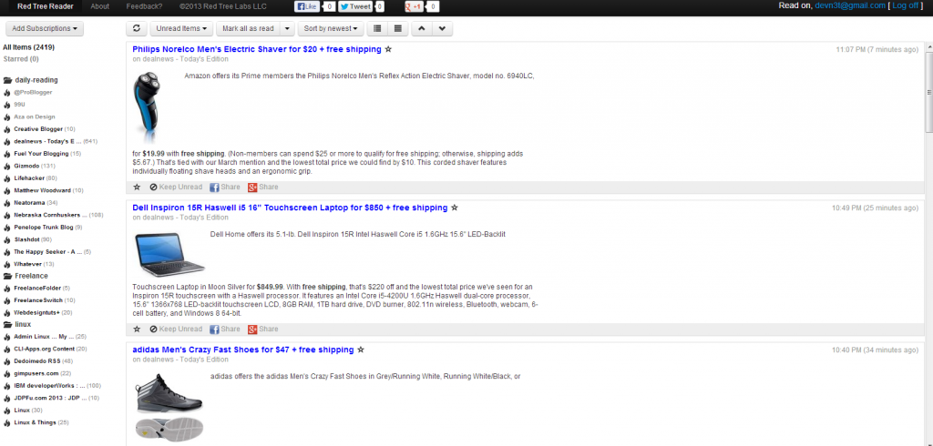
red tree readerWith both whole article view (expanded) and a compact view (list) you can cycle through news quite quickly.  Red Tree Reader supports the same keyboard shortcuts you’ve come to know and love in Google Reader.  It’s creators GUARANTEE it is bug free…and you can read more about this nice minimal reader here.

If you’re looking for a reader that matches Google Reader but doesn’t attempt to plug into every social network on the planet while implementing whiz bang bells and whistles that you’ll never use or want to use, Red Tree Reader is for you.  I tried the mobile site in my phones browser and found it functional but all together NOT ideal.  If mobile RSS is your thing, give it a go and see what you think…I think this would work better on a tablet than on a phone.

My final verdict on this reader is that it will find a home with those of us who hate fluff and think content is king.

Pros:  Lightweight, fast, support for keyboard shortcuts, minimalistic, imports feeds quickly and imports google feeds in seconds, quick feed displays

Cons: Not for social network people, very plain and thus not for people who want anything flashy, can’t reorder feeds, no feed icons, mobile site isn’t the best feed experience at all but works.

Homepage:  http://redtreereader.com

Summary

These 2 RSS readers have a lot going for them and I haven’t seen any of the big tech news websites say anything about them.  This is really a shame because they’re two of the best ones I’ve found over the past few months since I started looking.  I hope this post helps you make a decision in your quest to replace Google Reader.  If you have further questions about these readers, I’ll do my best to answer them in the comments.  Thanks for reading!

Feedly, Chromium , and Google Reader

How many of you use Google Chrome or Chromium and have more than 10 active feeds in Google Reader?  I’m sure that most of you raised your hand…well, maybe not physically but a mental raising of the hand I suppose.  How about 20+ feeds?  30+?  Is your (virtual) hand still up?  Mine is.

I’m plugged in…maybe too plugged in.  The “mark all items read” button received much use in my RSS reader.  I found myself skipping more than I actually read.  Google reader is awesome, don’t get me wrong, but it is a bit simplistic and plain…which is fine, it does its job well.  I’m informed.  But I often times find myself trying to sift through the cruft that is my various feeds.  I have wordpress design feeds, freelance feeds, Linux feeds, sports feeds, business feeds, inspirational feeds, youtube feeds, feeds about feeds, and feeds feeding those feeds.

Feedly
Feedly, RSS on Steroids

I wanted to get more from my news/RSS.  Enter Feedly.  Feedly is a way that my feeds become VISUAL.  Instead of line by line by line, I’m given tiles and mosaic patchworks in an easy to read format.  I have variety.  I have images.  I have screenshots.  I have thumbnails.  I can see my feeds.  I can see what they’re describing.  I can see what people are blogging about.  I started using Feedly a mere 4 days ago and I have completely caught up on my reading.  Before I started I had over 3000 articles and was many, many days behind on my reading.  I’m completely caught up now with a manageable 200  articles to read.

Does this mean I’m reading thousands of articles with Feedly?  Not by a long shot.  But I’m finding what is important to me faster and thus being much more efficient.  I’m still skipping many articles…but at least now I know WHAT I’m skipping.  I’m not just marking all read so that I can catch up.  Feedly allows me to peruse my feeds in almost a catalog fashion which speeds up my reading times and focuses my attention on the things that catch my eye.

Feedly is free by the way.  I use it with Chromium/Chrom (works with any web browser though, just head over to their website) and you can too.  Install it as a web application in the Chrome web store.  Once installed, synchronize it with your Google Reader account…things you mark as read in Feedly will be marked read in your Google Reader account and vice versa.  I also use it on my Android tablet.  Make sure to check out the settings page in Feedly to configure the right layout and colors for yourself to make things easier to read and fit your workflow.  I guarantee you will find yourself reading more interesting articles…bookmarking links more…and paying attention to what matters to you.

Google News Redesign is Horrible

So, what do you think of the Google News redesign?

You like it???  Tell me where you live so I can come hit you on the head a couple of times with a tack hammer…we’ll see if that jars anything loose.  All kidding aside (no I don’t want to hit anyone on the head with a tack hammer), there is plenty of negative feedback on the redesign.  If you’re not sure what changed, the original Google News Blog announcement is here (with screenshots) and you can also see it on your own computer (for now…they may roll it out to other countries besides the US soon so this may not work perpetually) here is how to check:

  1. Login to your google account.  Go to http://google.com/news
  2. Now visit this link in a new tab:  http://www.google.ca/news

The difference initially looks subtle but once you start scrolling it blares like a fog horn in your head.  I’m not the only one who thinks the redesign sucks.  The original announcement is filled with negative comments about the redesign.  Look on the right hand column of the announcement to see related posts and you’ll quickly see there are plenty of people who despise this ‘improvement’.  Even looking in the google news general forum results in the most popular threads being discussions about how bad the redesign actually is.

People have even begun to label this redesign as the “New Coke” of Google products.  I’m thinking they may be right.  Don’t remember the New Coke snafu?

How Can We Tell Google Their Redesign Sucks?

Most people have been going to the support area for Google news.  In my opinion, this is ABSOLUTELY the wrong area.  Instead, head over to the blog announcement page and you’ll see a link to the Help Center.  Once there, on the top right hand corner of the announcement is a link to comments. As of the writing of this article there were about 15 comments on this change.

It is my theory that Google is only paying attention to this comments section and not to the thousands upon thousands of posts taking place inside their support forums.  Afterall, is complaining that the redesign sucks really a support issue?  Make your voice known by visiting the Help Center and dropping a comment via the comments link there.  Clicking this link opens up a sidewiki comment system.  Make sure you are signed into your google account when leaving a comment.

So what are the problems with Google News?

Tailored News – Google said the new redesign is “tailored to your interests” aka “news for you”.  Here’s the thing…I don’t want news tailored to my interests.  I want unedited and unfiltered news.  The reason I liked Google News in the first place was because I didn’t have paid sponsors results jockying to the front of the page.  I could read liberal and conservative news side by side.  I could get one side of the story and the other side of the story.

Now, I get only the side that interests me.  This doesn’t make for a well informed, rounded individual.  In other words, I want to see EVERYTHING and decide what to read…I don’t want that taken away from me at the beginning.

Scrolling – Congratulations Google!  It now takes me 6 pages of scrolling to see the same amount of news I used to be able to read in 2.  Boy I would have loved to be a fly in the wall on the meeting where the ‘stream’ concept was discussed…a big, monsterous fly so that I could have fly puked right on whoever thought it was a good idea.

Google news is now a facebook stream of news.  I don’t want that.  If I wanted a facebook stream of news, I’d create a facebook account and friend all the news agencies out there and wait for the news to stream to me.

It now takes me three to four times longer to read news than it did in the past.  I’m also getting a poor sample of the news.  I’m missing tons of articles I got in the past and headlines don’t pop like they used to.  It’s also HARDER to read when you’re scrolling 5000 lines of text.  For this reason alone the redesign is 20lbs of crap poured into a 10lb bag.

Local News – Local news went from having its own section to having 3 headlines.  Thanks for reducing my local news Google…I really appreciate that.  Good to know that I don’t need to be reading what’s happening right outside my window.

Fast Flip Reduction – Remember when fast flip was 3-4 wide across the bottom of your google news page?  Now it’s 1 article on the small right hand column.  WORTHLESS.  And of course, there is no way to get rid of it from your google news page.

Spotlight – What the heck is this section for?  What do these articles have in them that allows them to have a spotlight shined on them?  Do publications pay Google to be included in this section?  Why can’t I remove this section if I want to?

Most Popular – These articles are the most popular according to whom?  Am I just supposed to trust Google that they are the most popular ones out there?  Do publications pay Google to be included on this section?  Why can’t I remove it?

A good article that includes many of the reasons I discussed above can be found here.

The Squeekiest Wheel?? Alternatives??

So, if we complain en masse, will Google listen?  Does the squeekiest wheel get the most oil?  I hope so.

Until then, I won’t be using Google News. A suitable and tolerable substitution can be found at Ask.com…for those of you saying “Try Bing!” I did and it sucks.  Ask.com’s News Page is simple and doesn’t require me to scroll 40 times just to read news.  Thanks for keeping it simple Ask!  You’ve got a new supporter!

What do you think of the new google news?  Please let me know with a comment below.  The redesign hasn’t been rolled out in all areas yet so you may not see it in your location…however, be warned that it is probably coming.  Hopefully, Google will realize this move is the New Coke Snafu and backtrack to their original design…not because the features they want to implement suck, but because when implementing them, they made reading the news MUCH harder than it should be.

Thunderbird and Lightning .8

I saw that Lightning .8, a calendar extension for thunderbird, had been released and my heart jumped.  Had they fixed the memory leak that forced me to abandon it in version .7?

I used to use Lightning for my google calendar in versions before .7…

When .7 came out, it caused Thunderbird to rocket memory usage above 80% which brought my computer to a screeching halt.  I figured I’d not use it until next version (and submitted a bug report as well).

Today I downloaded .8 in hopes it would work better.  It doesn’t.  Memory usage still skyrockets when attempting use the google calendar (provider addon) and the remember mismatched domains add on with it (otherwise you’re unable to connect or get a popup every time you view).

Is it one of these plugins causing it?  Is it Lightning?  I’m leaning toward the latter…even when uninstalling the extensions, I still get memory usage skyrocketing.  Either way, syncing your google calendar with Lightning isn’t a very smooth thing to do if it causes your Linux desktop to screech to a halt.

I guess there is always evolution with built in google calendar support.  Anyone else getting these problems?

At work, we use Zimbra for emailing.  I use Thunderbird with IMAP as my desktop client.  I’ve also seen that as of Zimbra 5.0 RC2, they will have the ability to sync with Lightning.  Good news!  Now if Lightning would stop leaking!

Zimbra or Google Calendar with Thunderbird and Lightning

The title sounds a bit Mythological eh? I originally published this entry on my work blog but felt that some people might be able to get some use out of this tip. To use it, you’ll need Zimbra or Google Calendar. I’ll cover Zimbra mostly and then give a link on how to setup Google Calendar at the end. For those interested, my work blog is here.

If you don’t have Zimbra, they have a free Open Source Community Edition available. It’s feature rich and quite configurable for your email. It can even be used to retrieve multiple email sources and bring them all into one place…it also has identity management so you can send from multiple accounts. Very nice stuff.

“I use Thunderbird for my email client. It’s quite speedy and nice. Coming from various places of employment that used Outlook and Exchange, I miss being able to schedule appointments via my email client (of course, with Zimbra, I’m able to do this via the web interface..but I like using Thunderbird for its ability to sort and
handle my email).

Enter Lightning, the sunbird-like extension for Thunderbird. So how does one integratelightning with say, Zimbra? It was rather simple and easy to do so. I’m posting what I did to get this up and running so that others won’t fumble through the Zimbra forums trying to piece various posts together finally arriving at a solution after banging heads against the wall repeatedly. Note that I’m assuming you use Zimbra/Thunderbird with IMAP.

Continue reading “Zimbra or Google Calendar with Thunderbird and Lightning”

Creative Commons License
Except where otherwise noted, the content on this site is licensed under a Creative Commons Attribution-NonCommercial-ShareAlike 4.0 International License.