HostGator, Linux and The Dukes of Hazzard

If you’re old, like me…let’s say, over 30 years old…you might remember the television show “The Dukes of Hazzard”.  Waylon Jennings, a popular country music singer during the late 70’s and early 80’s sang the theme song.  The lyrics are:

Just the good ol boys, never meaning no harm

Beats all you ever saw, been in trouble with the law

since the day they was born

Many times in IT job settings, you’ll find that you need to become one of ‘the good ole boys’ in order to accomplish your job.  You have to like the things others’ like (or pretend to), you have to laugh at the things others’ laugh at.  In other words, you may have to become all things to all people.  It’s stupid that things are this way…but if you don’t change, you’ll find yourself on the outside looking in.  I’ve always been one to try and strike the right balance between becoming what my coworkers wanted me to become versus what I want to be.  Through the almost 10 years I’ve been blogging here, I’ve both sponsored and at one time hosted Ken Starks (aka Helios) blogging efforts and even his Lobby4Linux initiative…and I still consider him to be a great friend as well as an uncompromising voice in the world of Linux.  Over at his blog, he gave the anonymous experience of one HostGator employee.  You can read her experience over at his blog but here is an excerpt:

But my friend did have trouble answering a question and she dutifully IM’ed her tier two technician for help…. Twice. Then three times. And finally a fourth. She didn’t even get a response from a tier three tech or a supervisor. And I’ve been a tier three technician…I played a lot of online games. Help requests were infrequent. We mostly helped supervisors keep track of call times. She was a nervous wreck…and the customer wasn’t happy. She had to take down the customer’s number and promise to call them back when she found the answer to their question. A callback counted against her in her call stats and bonuses can be earned or lost on customer callbacks. She was close to tears, but nothing like she was when she found out why she being ignored when she asked for help. It seems that there is a little initiation when you go to work in that particular call center. It’s a game of sorts and it all boils down to this.

I’ve experienced things just like this in my career in the world of IT…not to the level above…but in some form or another, I’ve been hindered at performing my job by someone else who wanted to ‘initiate’ me into working where they do…or someone who just didn’t like that I spoke in an accent.  It’ seems rather stupid that someone would want you to become part of their ‘good ole boys’ network before they give you the help you need.  It’s unprofessional and counterproductive.  The only real permanent damage it does happens to the end user.

One can’t get too mad at companies though…they may not even know it is going on.  It starts at the mid-management level.  Managers who enable and allow this sort of behavior on their teams or ignore this sort of behavior are to blame.  Having a workplace that isn’t fun to work at unless you’re a part of the ‘good ole boys’ or that makes the end user suffer just for a laugh isn’t a good workplace.  Turnover will be high.  Ego’s will be allowed to cultivate and grow.  Cliques will form.  Boundaries will be crossed. In the end, your workplace suffers because it becomes hostile to those who refuse to adapt their behavior to jive with the few who behave in this way.  If you’re an IT Manager, take note of the story I linked to above.  Don’t be that guy.  Don’t let your employees set the tone for the work environment.  Make it your mission to set the tone yourself.  Making your work environment an inviting and supporting place to work isn’t hard to do.

Disillusioned by the Community

There are times when I don’t want to admit that I use and love Linux.

It’s true…at times, I’m embarrassed to tell people that I’m part of the community as a whole.

You may wonder when these times are…right now is one of those times.  I despise infighting found in free and open source software…specifically, I really don’t like it when people have one sided experiences and apply their experience to ALL areas of Linux and open source software.  Case in point is this blog post on KDE 4.6 experience in Ubuntu.  For everyone out there, please be advised that Ubuntu is not equivalent with ALL Linux.  In fact, Ubuntu does Gnome very well…but it doesn’t do KDE well at all.

If you truly want to know what KDE 4.6 is like, you need to go with a KDE specific distribution like Mandriva and ride that cutting edge.  I can guarantee you won’t be greeted by crash handlers and all sorts of nonsense that you’ll get inside Ubuntu when you install KDE along side of your Gnome install.

Posts like the one I linked to above make me angry…it’s like driving a Volvo compact car and then dismissing every other car company that makes a compact car as equivalent the experience on the Volvo.  To me, you need to drive each implementation (each companies interpretation) and make an informed decision as to what you find.  Taking a test drive of a Volvo compact and then bad mouthing all compact cars is ignorant…and in my opinion, that is what the person above does with KDE 4.x

I’m a staunch defender of KDE 4.x and I’ve blogged about ignorance surrounding it in the past.  Not all gripes about it are ignorant…but a majority of people’s problems they have with it are simply people band-wagoning together to trounce something because it’s cool to do so.  Much the same is M. Night Shyamalan’s Airbender movie…people talked so much crap about the movie and him as a director, I thought that the movie was going to be the worst movie of all time.  It wasn’t near as bad as people were making it out to be and Shyamalan isn’t the worst director out there by any means.

I think overall, KDE 4.x has become the M. Night Shyamalan of the Linux world…a very talented director(project) that everyone was accustomed to making great movies(desktops) that doesn’t want to be pigeon holed into fitting what others feel it should fit.  KDE 4 is not KDE 3 and for good reason.  It’s being coded and made into something different yet subtly similar because it’s 2011 and not 1996.  If you don’t like it, don’t use it.

IF you don’t use it…don’t trash talk it.

If you want an HONEST representation of it, go to a distribution that prides itself on providing a good implementation of it.  Saying “Ubuntu is the most popular and people are going to try it out on Ubuntu” is wrong…because I don’t know of many end users that will enable a PPA repository and possibly jack up their Gnome install to give it a go…when they can just pop in a Live CD and give it a try….I think the poster of the blog entry above forgot about the magic of Live CD’s for his ‘review’.  It’s too bad that he feels Ubuntu’s lack of attention to all things KDE are representative to KDE as a whole…and it’s too bad his attempt at ascribing this notion comes off as troll-like.

I don’t use Ubuntu at all yet you don’t see me trolling the Ubuntu boards talking about how crappy I feel it is.  If you use Linux you are a part of the Linux community as a whole.  This community encompasses all distributions and all desktop environments.  You have a responsibility therefore; if you want to see Linux succeed, be tolerant and understanding of opposing distros/desktops. Talking trash about other opposing opinions is irresponsible and juvenile.  I hope someday people take this inherent and implied cordiality to heart.  Until then, we have posts like the one above…whether inadvertently geared to bash KDE or absolutely geared to bash KDE…it nonetheless bashed it.  I hope we can grow past things like this in the future.

Google News Redesign is Horrible

So, what do you think of the Google News redesign?

You like it???  Tell me where you live so I can come hit you on the head a couple of times with a tack hammer…we’ll see if that jars anything loose.  All kidding aside (no I don’t want to hit anyone on the head with a tack hammer), there is plenty of negative feedback on the redesign.  If you’re not sure what changed, the original Google News Blog announcement is here (with screenshots) and you can also see it on your own computer (for now…they may roll it out to other countries besides the US soon so this may not work perpetually) here is how to check:

  1. Login to your google account.  Go to http://google.com/news
  2. Now visit this link in a new tab:  http://www.google.ca/news

The difference initially looks subtle but once you start scrolling it blares like a fog horn in your head.  I’m not the only one who thinks the redesign sucks.  The original announcement is filled with negative comments about the redesign.  Look on the right hand column of the announcement to see related posts and you’ll quickly see there are plenty of people who despise this ‘improvement’.  Even looking in the google news general forum results in the most popular threads being discussions about how bad the redesign actually is.

People have even begun to label this redesign as the “New Coke” of Google products.  I’m thinking they may be right.  Don’t remember the New Coke snafu?

How Can We Tell Google Their Redesign Sucks?

Most people have been going to the support area for Google news.  In my opinion, this is ABSOLUTELY the wrong area.  Instead, head over to the blog announcement page and you’ll see a link to the Help Center.  Once there, on the top right hand corner of the announcement is a link to comments. As of the writing of this article there were about 15 comments on this change.

It is my theory that Google is only paying attention to this comments section and not to the thousands upon thousands of posts taking place inside their support forums.  Afterall, is complaining that the redesign sucks really a support issue?  Make your voice known by visiting the Help Center and dropping a comment via the comments link there.  Clicking this link opens up a sidewiki comment system.  Make sure you are signed into your google account when leaving a comment.

So what are the problems with Google News?

Tailored News – Google said the new redesign is “tailored to your interests” aka “news for you”.  Here’s the thing…I don’t want news tailored to my interests.  I want unedited and unfiltered news.  The reason I liked Google News in the first place was because I didn’t have paid sponsors results jockying to the front of the page.  I could read liberal and conservative news side by side.  I could get one side of the story and the other side of the story.

Now, I get only the side that interests me.  This doesn’t make for a well informed, rounded individual.  In other words, I want to see EVERYTHING and decide what to read…I don’t want that taken away from me at the beginning.

Scrolling – Congratulations Google!  It now takes me 6 pages of scrolling to see the same amount of news I used to be able to read in 2.  Boy I would have loved to be a fly in the wall on the meeting where the ‘stream’ concept was discussed…a big, monsterous fly so that I could have fly puked right on whoever thought it was a good idea.

Google news is now a facebook stream of news.  I don’t want that.  If I wanted a facebook stream of news, I’d create a facebook account and friend all the news agencies out there and wait for the news to stream to me.

It now takes me three to four times longer to read news than it did in the past.  I’m also getting a poor sample of the news.  I’m missing tons of articles I got in the past and headlines don’t pop like they used to.  It’s also HARDER to read when you’re scrolling 5000 lines of text.  For this reason alone the redesign is 20lbs of crap poured into a 10lb bag.

Local News – Local news went from having its own section to having 3 headlines.  Thanks for reducing my local news Google…I really appreciate that.  Good to know that I don’t need to be reading what’s happening right outside my window.

Fast Flip Reduction – Remember when fast flip was 3-4 wide across the bottom of your google news page?  Now it’s 1 article on the small right hand column.  WORTHLESS.  And of course, there is no way to get rid of it from your google news page.

Spotlight – What the heck is this section for?  What do these articles have in them that allows them to have a spotlight shined on them?  Do publications pay Google to be included in this section?  Why can’t I remove this section if I want to?

Most Popular – These articles are the most popular according to whom?  Am I just supposed to trust Google that they are the most popular ones out there?  Do publications pay Google to be included on this section?  Why can’t I remove it?

A good article that includes many of the reasons I discussed above can be found here.

The Squeekiest Wheel?? Alternatives??

So, if we complain en masse, will Google listen?  Does the squeekiest wheel get the most oil?  I hope so.

Until then, I won’t be using Google News. A suitable and tolerable substitution can be found at Ask.com…for those of you saying “Try Bing!” I did and it sucks.  Ask.com’s News Page is simple and doesn’t require me to scroll 40 times just to read news.  Thanks for keeping it simple Ask!  You’ve got a new supporter!

What do you think of the new google news?  Please let me know with a comment below.  The redesign hasn’t been rolled out in all areas yet so you may not see it in your location…however, be warned that it is probably coming.  Hopefully, Google will realize this move is the New Coke Snafu and backtrack to their original design…not because the features they want to implement suck, but because when implementing them, they made reading the news MUCH harder than it should be.

Do Package Managers Spoil Us?

I thought of this interesting question the other day while messing around with Slackware 9.0 which was one of the last versions of Slackware to come on a single disk. The goal was to try to take a Slackware 9.0 install to the most recent stable and it was almost accomplished. Glibc was the largest hassle…and I made it to Slackware 11.0 before something caused things to not boot at all. All things considered, I spent 3 days on trying to get Slackware 9 to current.

Slackware for those of you that don’t know, has no dependency resolving package manager. Previously, a good attempt was made with swaret and that was my first jump into package managers with dependency resolution all together when it came out…but Swaret is no longer being maintained and doesn’t really work well anymore.

Since Slackware has no real dep resolving package manager…it’s one of the last ‘true’ Unix like Linux versions out there. Back in the early to mid nineties…things were exactly like this. If you wanted to update your Linux version…you stepped through it manually and tried to get things to work. What was great about Slackware was making your own Slack packages with source…no dependency resolution but in the process of making the package you’d have all the dependencies eventually installed. In this entire process, you became VERY familiar with your system…how it booted, what run level things occurred at, how cron jobs worked, etc. You were baptized by fire so to speak…you were to sink or swim.

As I said, this got me thinking…do we rely on dependency resolving package managers TOO much? They’re cliché now of course…run of the mill. Back in the 1990’s though rpm was the only true package management system around…and rpm was never designed for internet consumption. The guys who wrote rpm had in mind CD and floppy upgrades. Fast forward to now and we have zypper, pacman, urpmi, deb, and conary…all built with online repositories in mind. Do these managers take the heavy lifting away for new users? Do they spoil them?

Do systems break less with easier resolutions due to package managers? Does it mean that the new user of today won’t be as experienced as the old user of yesterday?

I think it might.

Users in the past had to chip away and reassemble with less documentation and no package manager. This meant that the user of yesterday ripped apart systems and packages to discover how they worked and which cogs fit where.

The user of today follows step by step instructions and the software is given a sane set of defaults by most package developers when said package is installed.

Does this make for lazy users?

I don’t think users are lazy per se…but as previously stated, spoiled ones. And it’s no fault of their own…it’s the direction the software has taken us. Now the questions we need to answer are:

  1. Is this direction the correct direction we should be heading?
  2. Are there better approaches to package management that don’t follow the model we have currently (other than Conary)
  3. Can we come up with a system that doesn’t make new users spoiled?

I think I’m of both worlds…I started off with no package manager but managed to ride the wave of Red Hat 7.2 and above followed by Mand{rake,riva} and PCLinuxOS. I’m both spoiled and unspoiled. I know what it takes to manage a system without a conventional package manager but I also know how much time it can save me to use one. I sometimes find myself wanting less though…less and more. Less time and more hands on gutting the system. I think I’m in the minority though.

How about you, as a reader of this article? Do you think new users are spoiled by conventional package management systems? Do you see solutions or have ideas we can discuss? Is this really just a process we can improve or is there any programming to be done? Please sound off in the comments section!

Hate KDE4? Ignorance Is Probably the Culprit

Let’s bust some myths today because a majority of KDE 4 haters out there have the same reasons for hating it.  I’m pretty sick of seeing posts and news articles about “why I don’t like KDE 4” and then seeing that the real reason the person is upset is because they don’t spend an extra few moments trying to figure things out…aka lazy and ignorant.

KDE 4 was NOT feature complete when it came out in the 4.0 version.  It IS feature complete (in my opinion) with the 4.2 and 4.3 versions.

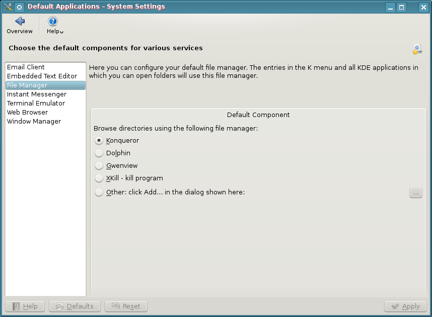
Ignorant Reason #1 – I hate Dolphin and I Can’t Have Konqueror Anymore

filemanagerWrong, you can use Konqueror.  You don’t have to use Dolphin, but you’ll be missing out on a lot of useful stuff.  Tell you what, now that you know that you don’t have to use Dolphin, why not use KDE 4 and give Dolphin a try every so often…you can still use Konqueror in the meantime and now that you know you can, you don’t have to go around trumpeting that you can’t to everyone who will listen and saying what a piece of crap it is.  Forget that you’ll lose nepomuk and the semantic desktop by dismissing dolphin.  Don’t know what that is?  Let me google that for you…

I sure hope this solves many peoples beef with KDE 4 right out of the gate because this is one of the reasons I find all over the web.  I really think the problem is the lethargic attitude that prevails from die hard KDE 3 fans.  Honestly guys, give Dolphin a try…it’s really a pretty decent file manager and is light years ahead of any other DE file manager.

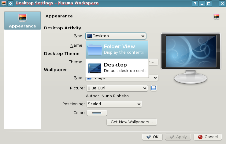
Ignorant Reason #2 – I Can’t Have Folders or Files on the Desktop Anymore

desktopsettingsWrong.  Right click on the desktop and choose “Desktop Settings”.  Select the drop down menu “Type” and select “Folder View”.  Your desktop now has folders, icons, and all other such things that you may want to clutter it with.

If you want to switch back to NOT using the folders and instead use widgets…right click on the desktop and choose “Folder View Settings” >> Select Type >> Desktop.

To top it off, if you select “Folder View”, the folders and icons act exactly like you would expect them to in KDE 3.  Not only can you select to show your desktop folders…but you can even show a folder like /home as your default desktop…show any folder you have access to, it’s up to you.  Yay right?  I give it a golf clap.  Let’s continue thinking out of the box and bust a few more myths.

Ignorant Reason #3 – I Can’t Move My Panel to the Top, Right, or Left.

panelmoveWrong.  Click the settings icon on the right hand side of your panel (it looks like a comma on the far right side of the panel).  The settings area pops open.  On that bar is something called “Screen Edge”.  Now, it seems pretty self explanatory that when you hover over the top of it, it gives you the 4 arrow icon that means you can drag and drop the panel wherever you want to…and being named “screen edge” seems to imply “which screen edge…left, right, bottom, or top…do I want this thing to appear on”.  Then again, I can see how screen edge can confuse people when you open the settings of a panel that resides on the screen edge.  Ok, maybe I can’t.  Well, at least you know you can move your panel around right?  Golf clap again?  Who plays golf anyway?

Ignorant Reason #4 – I Can’t Resize Folders and Files in Dolphin

Wrong again.  Are you sensing a pattern yet?  Open Dolphin, go to the directory where you want to increase the folder size.  Hold the control key down…now roll your mouse wheel and be amazed as the folder size increases.  Invest all your money in Yet Another Linux Blog stock and move to Nicaragua.  Golf clap on your way to expedia.com for purchasing tickets.

Ignorant Reason #5 – I Like to Use My Own Color Schemes…I Can’t Do That in KDE4.

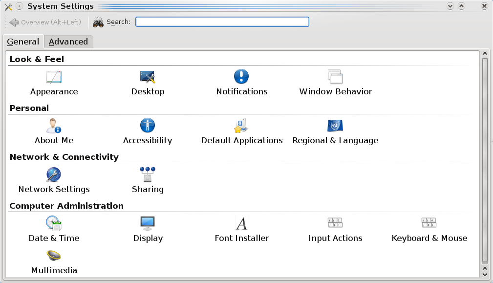
systemsettings
System Settings

KDE4 absolutely allows you to create your own color schemes.  It really helps to look around inside the system settings tool.  Go to your Kmenu >> System >> System Settings.  Once there, look for Appearance.  You can also use the top search

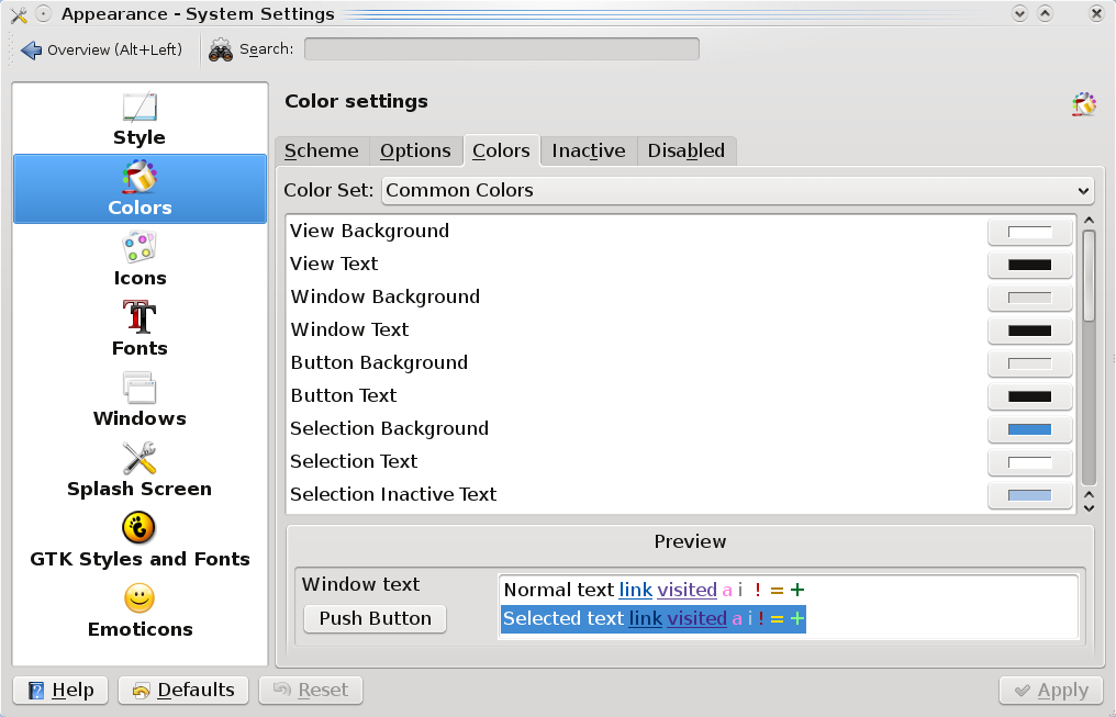
appearancecolors
Appearance Colors

bar to look for any term…so if you were to type “color” there, you’d see that Appearance & Display are returned.

Click on Appearance and you’re taken into a wonderful world of color and granular control of said color.  Change anything you’d like….go crazy.  I hear pink is the new green…or is it green that was the new pink?  Whatever.  The only limits are your imagination.  For those without imagination.

Ignorant Reason #6 – The Default Menu is Cludgy and Different and I Can’t Find Anything in KDE4

Now there is no right or wrong here…you could be right depending on who you talk to.  However, the nice part about KDE4 is that they include the previous menu for you.  Right click the Kmenu and choose “Switch to Classic Menu Style”.  Now your menu is the exact same as it would be in KDE 3.5.10.  Please remember that answers are out there…you just have to search for them.

Closing the Door on Myths

Hopefully, this closes the door on many misconceptions helps people who are ignorant to the leaps and bounds that KDE4 has made just in the past few months.  I’ve grown very tired of journalists and bloggers taking swipes at KDE4 and spreading misinformation about it.  If you have any questions about how to do something in KDE4, please leave a comment below and let’s work together in finding a solution.

PCLinuxOS 2009 Not Diggworthy

It’s really sad when the Alpha release of Ubuntu makes the front page of Digg.com for Linux/Unix… but the release, after two years of development, of PCLinuxOS 2009…a distribution that challenged Ubuntu for the #1 ranking at distrowatch in 2007-8…goes completely without being dug at all.  Well, to be fair, it was dugg by 18 people at the time of this post.  This just goes to show you, all those people that accused PCLinuxOS of “fixing” the distrowatch.com rankings last year may have been a bit paranoid and way off base.  Just the same, viral websites have an observable slant when it comes to things that are seen as cool so I really shouldn’t be suprised.  I just wish that distributions that deserve praise got it when they deserve it…and that more got it more often for what they do.

Creative Commons License
Except where otherwise noted, the content on this site is licensed under a Creative Commons Attribution-NonCommercial-ShareAlike 4.0 International License.